from phasic import Graph, with_ipv
import sys
import numpy as np
import pandas as pd
import matplotlib.pyplot as plt
from matplotlib.colors import LogNorm
import seaborn as sns
import vscodenb
np.random.seed(42)Moments and distributions
Callback function (decorated with IPV) for the standard Coalescent (?@sec-coalescent), which represents the waiting time until all the sampled lineages have found thier most recent common ancestor.
nr_samples = 4

@with_ipv([nr_samples]+[0]*(nr_samples-1))
def coalescent(state):
    transitions = []
    for i in range(state.size):
        for j in range(i, state.size):
            same = int(i == j)
            if same and state[i] < 2:
                continue
            if not same and (state[i] < 1 or state[j] < 1):
                continue
            new = state.copy()
            new[i] -= 1
            new[j] -= 1
            new[i+j+1] += 1
            transitions.append((new, state[i]*(state[j]-same)/(1+same)))
    return transitions
Build the corresponding graph:
graph = Graph(coalescent)
graph.plot()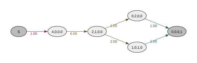
Exact moments
Once the graph is created, you can compute any number of moments exactly.
graph.expectation()1.4999999999999996graph.variance()1.1388888888888893graph.moments(5)[1.4999999999999996,
3.388888888888888,
10.583333333333332,
42.907407407407405,
215.5092592592592]The MGF has the beautiful property that all moments are expectations with rewards derived from lower moment expectations at each state. Here is the first and second one again:
graph.expectation(), 2 * graph.expectation(graph.expected_waiting_time())(1.4999999999999996, 3.388888888888888)Expected time to absorption given any state
In addition to the waiting time from a starting state, we can compute the expected waiting times assuming each state is the starting state:
graph.expected_waiting_time()[1.4999999999999996, 1.4999999999999996, 1.333333333333333, 1.0, 1.0, 0.0]Or with the state vectors:
display(graph.plot(size=(5,2)))
pd.DataFrame(graph.states()).assign(expectation=graph.expected_waiting_time()).style.hide()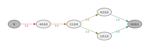
| 0 | 1 | 2 | 3 | expectation |
|---|---|---|---|---|
| 0 | 0 | 0 | 0 | 1.500000 |
| 4 | 0 | 0 | 0 | 1.500000 |
| 2 | 1 | 0 | 0 | 1.333333 |
| 0 | 2 | 0 | 0 | 1.000000 |
| 1 | 0 | 1 | 0 | 1.000000 |
| 0 | 0 | 0 | 1 | 0.000000 |
Expected total time spent in each state
We can compute the exact waiting (sojourn) time spent in each state:
graph.expected_sojourn_time()[0.0,
0.16666666666666663,
0.33333333333333326,
0.3333333333333333,
0.6666666666666666,
0.0]… which obviously sums to the to the absorption time:
sum(graph.expected_sojourn_time()), graph.expectation()(1.4999999999999998, 1.4999999999999996)CDF / PDF
The distribution methods reuse cached computations and recompute only if the graph changes. Compare the running times for the first and second call to the function:
time = np.arange(0, 4, 0.001)%%time
cdf = graph.cdf(time)CPU times: user 231 μs, sys: 25 μs, total: 256 μs
Wall time: 258 μs%%time
cdf = graph.cdf(time)CPU times: user 51 μs, sys: 0 ns, total: 51 μs
Wall time: 52 μsfig, (ax1, ax2) = plt.subplots(1, 2, figsize=(8, 3))
ax1.plot(time, graph.pdf(time))
ax1.set_title("PDF")
ax2.plot(time, graph.cdf(time))
ax2.set_title("CDF") ;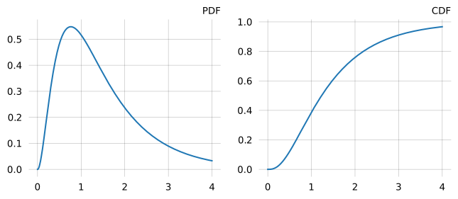
Rewards
We can assign a zero or a real-valued strictly positive reward to each state to scale the waiting time in each state. The phase-type distribution is then no longer the time until absorption but the accumulated reward until absorption. However, when all states have unit rewards, the two interpretations are equivalent. Rewards must be either:
- A 1-D array of length
n_vertices(one reward per vertex). - A 2-D array of shape
(n_features, n_vertices)for multivariate phase-type distributions where each feature has its own reward vector.
As in this case, rewards can often be extracted from the collection of state vectors:
graph = Graph(coalescent)
reward_matrix = graph.states().T
reward_matrix
array([[0, 4, 2, 0, 1, 0],
[0, 0, 1, 2, 0, 0],
[0, 0, 0, 0, 1, 0],
[0, 0, 0, 0, 0, 1]], dtype=int32)E.g., the rewards for states corresponding to lineages with two descendants (where mutations would produce doubletons in the sample) are:
doubleton_rewards = reward_matrix[1]
doubleton_rewards
array([0, 0, 1, 2, 0, 0], dtype=int32)With these rewards, the phase-type distribution now represents the total doubleton branch length (total length of branches with two descendants).
graph.expectation(doubleton_rewards), graph.variance(doubleton_rewards)(0.9999999999999999, 2.333333333333333)Not passing any rewards to the methods implicitly assumes unit rewards for all states but the starting and absorbing states:
graph.expectation(), graph.expectation([0, 1, 1, 1, 1, 0])(1.5, 1.5)Here is the SFS (Site Frequency Spectrum) computed in this way. The absorbing state accumulates no rewards. So in this case, the 4’ton rewards are zero because they are only accumulated by the absorbing state.
labels = [f"{i+1}'ton" for i in range(reward_matrix.shape[0])]
sfs = [graph.expectation(r) for r in reward_matrix]
plt.figure(figsize=(4, 3))
sns.barplot(x=labels, y=sfs, hue=labels) ;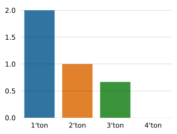
Reward transforms
Reward transformation removes the states with zero rewards and rescales the remaining edges.
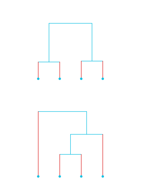
singleton_rewards = reward_matrix[0]
singleton_graph = graph.reward_transform(singleton_rewards)
singleton_graph.plot()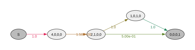
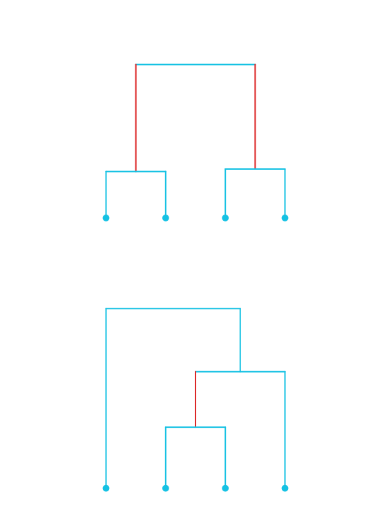
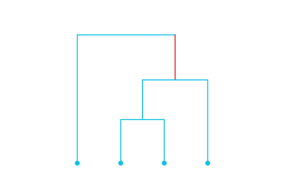
doubleton_rewards = reward_matrix[1]
doubleton_graph = graph.reward_transform(doubleton_rewards)
doubleton_graph.plot()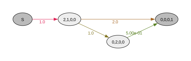
tripleton_rewards = reward_matrix[2]
tripleton_graph = graph.reward_transform(tripleton_rewards)
tripleton_graph.plot()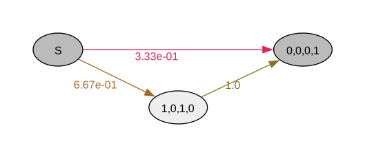
Computing the (unrewarded) expectation on the reward-transforming graph produces the same result as passing the rewards to expectation. I.e, singleton_graph.expectation() computes the same quantity as graph.expectation(singleton_rewards):
sfs = [
    singleton_graph.expectation(),
    doubleton_graph.expectation(),
    tripleton_graph.expectation(),
]
plt.figure(figsize=(4, 3))
sns.barplot(x=labels[:len(sfs)], y=sfs, hue=labels[:len(sfs)]) ;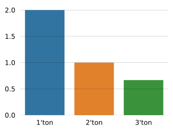
However, passing rewards to expectation, variance, moments, expected_waiting_time, and expected_sojourn_time methods etc. is much faster than reward-transforming the graph to then compute the unrewarded statistics:
graph = Graph(coalescent)
singleton_rewards = graph.states().T[0]%%timeit
graph.expectation(singleton_rewards)4.65 μs ± 41.2 ns per loop (mean ± std. dev. of 7 runs, 100,000 loops each)%%timeit
graph.reward_transform(singleton_rewards).expectation()30.8 μs ± 938 ns per loop (mean ± std. dev. of 7 runs, 10,000 loops each)Marginal distributions
The real use of reward transformation is that it provides the full distribution of accumulated rewards. For example if we want the marginal distributions:
graph.states().T[:-1]array([[0, 4, 2, 0, 1, 0],
[0, 0, 1, 2, 0, 0],
[0, 0, 0, 0, 1, 0]], dtype=int32)graph = Graph(coalescent)
reward_matrix = graph.states().T
reward_matrix = reward_matrix[:-1] # except absorbing state
times = np.arange(0, 5, 0.05)
labels = [f"{i+1}'ton" for i in range(reward_matrix.shape[1])]
for i, rewards in enumerate(reward_matrix):
revt_graph = graph.reward_transform(rewards)
plt.plot(times, revt_graph.pdf(times), label=labels[i])
plt.legend() ;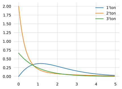
Marginal distributions can have a point mass at zero. In out coalescent example, there is a non-zero probability there is no 3’ton branch at all.
The marginal PDF can only represent the continuous part, but the point mass is represented as the deficit when the PDF is integrated over rewards (the probability distribution does not sum to one).
In the CDF, the point mass is represented as the cumulative probability at zero reward: The 3’ton CDF does not begin at zero probability like the 1’ton and 2’ton.
for i, rewards in enumerate(reward_matrix):
    revt_graph = graph.reward_transform(rewards)
    plt.plot(times, revt_graph.cdf(times), label=labels[i])
plt.legend() ;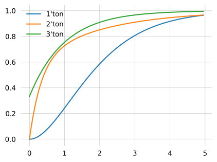
The PDF probability mass is 1 minus the deficit:
for i, rewards in enumerate(reward_matrix):
    revt_graph = graph.reward_transform(rewards)
    deficit = revt_graph.cdf(0)
    print(1 - deficit)
1.0
1.0
0.6666666666666667Approximated the same thing by numerically integrating the PDF:
import scipy.integrate as integrate

step = 0.01
times = np.arange(0, 100, step)
for i, rewards in enumerate(reward_matrix):
    revt_graph = graph.reward_transform(rewards)
    print(integrate.trapezoid(revt_graph.pdf(times, granularity=100000), times, dx=step).item())
0.9999937891689733
1.0000559430685312
0.6666756637359534State probability at time
state_probability (alias for stop_probability), computes the state probability: the probabilities of occupying each state at time t.
graph = Graph(coalescent)
graph.state_probability(0.2)
[0.0,
0.29978049956512576,
0.4964527753776389,
0.06299978987254216,
0.12599957974508433,
0.0]We can use that to compute the expected number of lineages across time:
times = np.arange(0, 5, 0.05)
expected_lineages_left = [
    np.sum(graph.state_probability(i)
           * np.sum(graph.states(), axis=1))
    for i in times
    ]

fig, ax = plt.subplots(1, 1)
ax.plot(times, expected_lineages_left)
ax.set_xlabel('Time')
ax.set_ylabel("Expected nr lineages") ;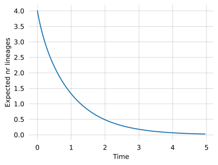
Scaling with rewards, we can also compute the expected number of each kind of lineage across time:
times = np.arange(0, 5, 0.05)
state_probs = np.array([graph.state_probability(i) * graph.states().T for i in times])
labels = [f"{i+1}'ton" for i in range(state_probs.shape[1])]
fig, axes = plt.subplots(1, 2, figsize=(8, 3))
axes[0].stackplot(times, np.sum(state_probs, axis=2).T)
axes[1].plot(times, np.sum(state_probs, axis=2), label=labels)
plt.legend() ;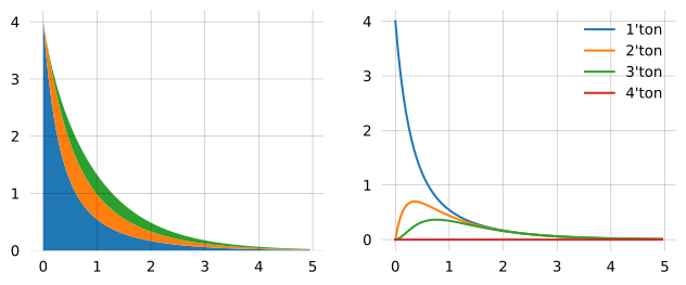
Accumulated time spent in states at time
We can also get the accumulated time that the process has spent in each state by some time. E.g. the total doubleton branch length accumulated by time 0.3:
graph.accumulated_occupancy(0.3)[0.0,
0.13955067135532132,
0.11830247033054878,
0.013473490250327203,
0.026946980500654406,
0.0]Plotting the accumulated occupancies across time show how they converge to the (exact) expected sojourn times (dashed lines):
times = np.linspace(0, 7, 100)
plt.plot(times, [graph.accumulated_occupancy(t) for t in times])
[plt.gca().axhline(t, ls='--', c='k', lw=1) for t in graph.expected_sojourn_time()] ;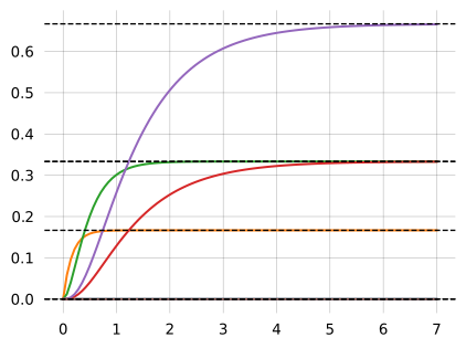
Random sampling
The library includes functions to do random sampling. These are useful to also validate the computations
graph = Graph(coalescent)
graph.sample(5)
array([2.21435634, 0.99927587, 1.08354789, 0.73726799, 2.19525916])fig, ax = plt.subplots()
samples = graph.sample(100000)
ax.hist(samples, bins=200, density=True, label='Samples')
x = np.arange(0, 2, 0.05)
ax.plot(x, [graph.pdf(t) for t in x], label='PDF')
ax.set_xlim(0, 2)
ax.legend();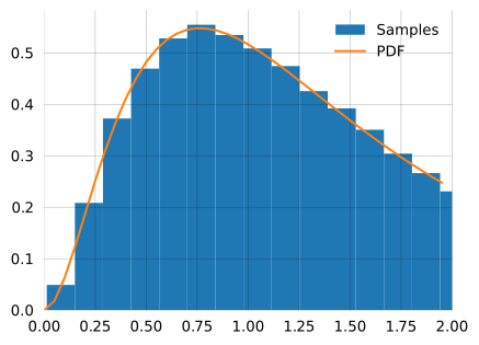
You can produce the moments from sampling if needed. Here is the empirical first moment computed from samples compared ot the exact first moment:
s = 10000000
np.sum(np.array(graph.sample(s))).item()/s, graph.moments(1)[0]
(1.5004287067519817, 1.5)Similarly for the second moment:
np.sum(np.array(graph.sample(s))**2).item()/s, graph.moments(2)[1](3.3879631420187013, 3.3888888888888884)